Designing for the people we serve
At the CFPB, we believe all of our work should be rooted in research and experience from the very people we aim to serve. For many, our website’s homepage is the front door to the CFPB. For that reason, we are excited to unveil our homepage redesign, which benefited from extensive user research and testing.
Usability goals
For this redesign we had a few goals in mind to improve the experience:
- Introduce ourselves and our mission clearly
- Build trust and credibility in the work we do
- Get people to the information they need, easily and quickly
To meet these goals, we took a strong focus on the user experience . We know that people who frequent our website come to submit a complaint, get help with housing issues, and find resources that can help them if struggling with finances, particularly given the COVID pandemic. We employed usability testing to get a better idea of how people go about finding those resources. We invited people to connect with us, review the homepage, and talk through some key tasks for finding information on our website.
Using analytics to prioritize mobile-first design
We learned that people usually visit government websites using mobile devices, thanks to data on analytics.usa.gov , so we used mobile-first design methods to update the homepage. We conducted usability tests on primarily mobile formats, and we even did our stakeholder demos on mobile as well.
Testing methods
We performed three rounds of testing over the course of 6 months: first, desirability testing to establish and refine the messaging and tone of the page, and then two rounds of scenario-based testing to identify and fix any usability issues.
In doing so, we learned that our mission isn’t always clear to people who may be unfamiliar with our work, and that oftentimes the language we’re using can feel unrelatable. We also heard that it was hard to find housing help and details on housing counselors, and participants told us they weren’t sure what kind of help we could provide surrounding the pandemic. To be responsive, we pulled in new graphics that better captured our mission, realigned key resources, and provided sections to help people find money topics and guides for major financial decisions.
Before:
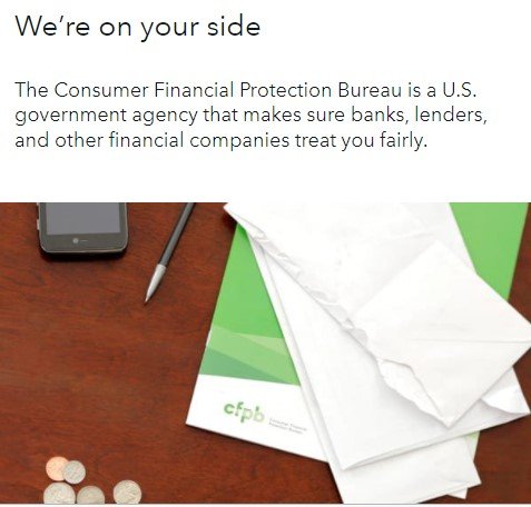
The previous version of the homepage showed a desk image, tagline, and 2 highlighted pages. It also included two consumer links, data and research links, and policy links as well as three highlights: Complaints, Ask CFPB (answers to common questions), and Tell Your Story.
After:
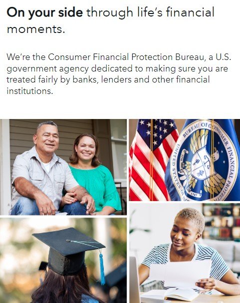
The new version of the homepage shows images of families, students, and our flag. It also includes three key resources, a list of money topics, and three guides.
What’s next?
As an agency that strives to be nimble and responsive to changing needs, we believe our website is never really done. We will continue seeking to understand what is most helpful to people by testing and iterating on our digital products, helping us improve the customer experience for everyone who comes to cfpb.gov to get more information and resources.
Check out our newly designed homepage!
Adopting a user-centered focus
While starting a new usability project may feel daunting, there are resources and steps to help break down the project into an easy recipe for an improved experience. Methods from 18F provides a great overview of multiple human-centered design tools, and guides for conducting usability testing . Before you start, make sure to have a plan for measuring success and tracking analytics. Other tools can also help you plan out the ideal experience, such as journey mapping . Once you have a hypothesis on how the experience should be built, you can begin testing prototypes . Starting small, such as with top task testing or user interviews , can help you get valuable feedback early on and save a lot of time and effort by avoiding potential rework for usability issues. Once you test with a few users, small improvements can be made before testing with more users to confirm your assumptions on the decided improvements. When ready to launch the new or improved experience, don’t forget to plan for the next cycle of research and improvements, this process should be cyclical and repeatable to ensure that the product meets with shifting user needs over time.
No matter where you are in your usability journey, keeping the user front and center will always help to keep the goals top of mind!